Build maps in the cloud with BigQuery DataFrames, Gemini, and CARTO
Giulia Carella
Senior Data Scientist, CARTO
Alicia Williams
Developer Advocate, Google Cloud
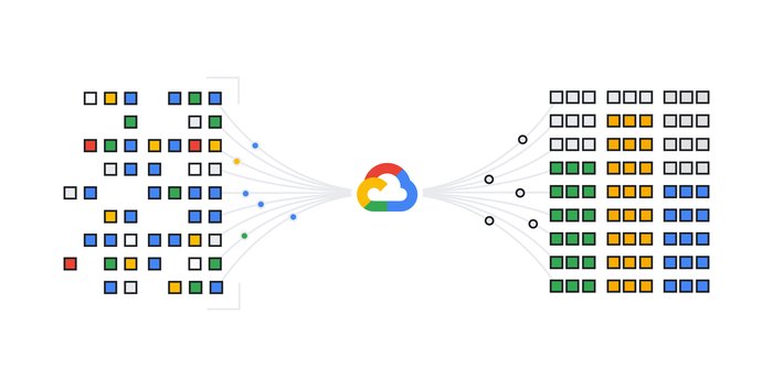
In today's data-driven world, unlocking the power of location data is crucial for gaining deeper insights and making informed decisions. By leveraging the scalability and efficiency of BigQuery for massive geospatial datasets and the visualization capabilities of CARTO, you can now create powerful interactive visualizations and conduct advanced spatial analysis — all without leaving your Jupyter notebook.
In this post, we’ll explore how to use BigQuery DataFrames in conjunction with CARTO visualization tools to help extend the reach of cloud-native analytics to Python users.
BigQuery DataFrames: a “Pythonic” DataFrame
BigQuery DataFrames is a set of open-source libraries that provide the common pandas and scikit-learn APIs that are implemented by pushing the processing down to BigQuery through SQL conversion.
For data scientists working in a Python environment, BigQuery DataFrames helps bring the scalability of BigQuery's engine while using the familiar Python syntax. This means data scientists can avoid data transfers between Python environments and databases and seamlessly work within a single platform, like Jupyter notebooks. With BigQuery DataFrames, users can leverage the efficiency of Python for data manipulation and analysis while the library translates their intentions to SQL and pushes it down to BigQuery.
BigQuery DataFrames handles the heavy lifting of processing massive datasets in the cloud, so data scientists can focus on what they do best: wrangling, analyzing, modeling and visualizing data, all at scale, and without sacrificing their preferred coding environment.
pydeck-CARTO
Then there’s pydeck-CARTO, a Python library that renders deck.gl maps in a Jupyter notebook with CARTO. This bridges the gap even further, acting as CARTO's integration with pydeck, and allowing you to create interactive and scalable map visualizations directly within Python notebooks.
This streamlined approach minimizes context switching between different tools, allowing data scientists to iteratively explore their data and visualizations simultaneously within the notebook, leading to faster discovery of insights from their geospatial data.
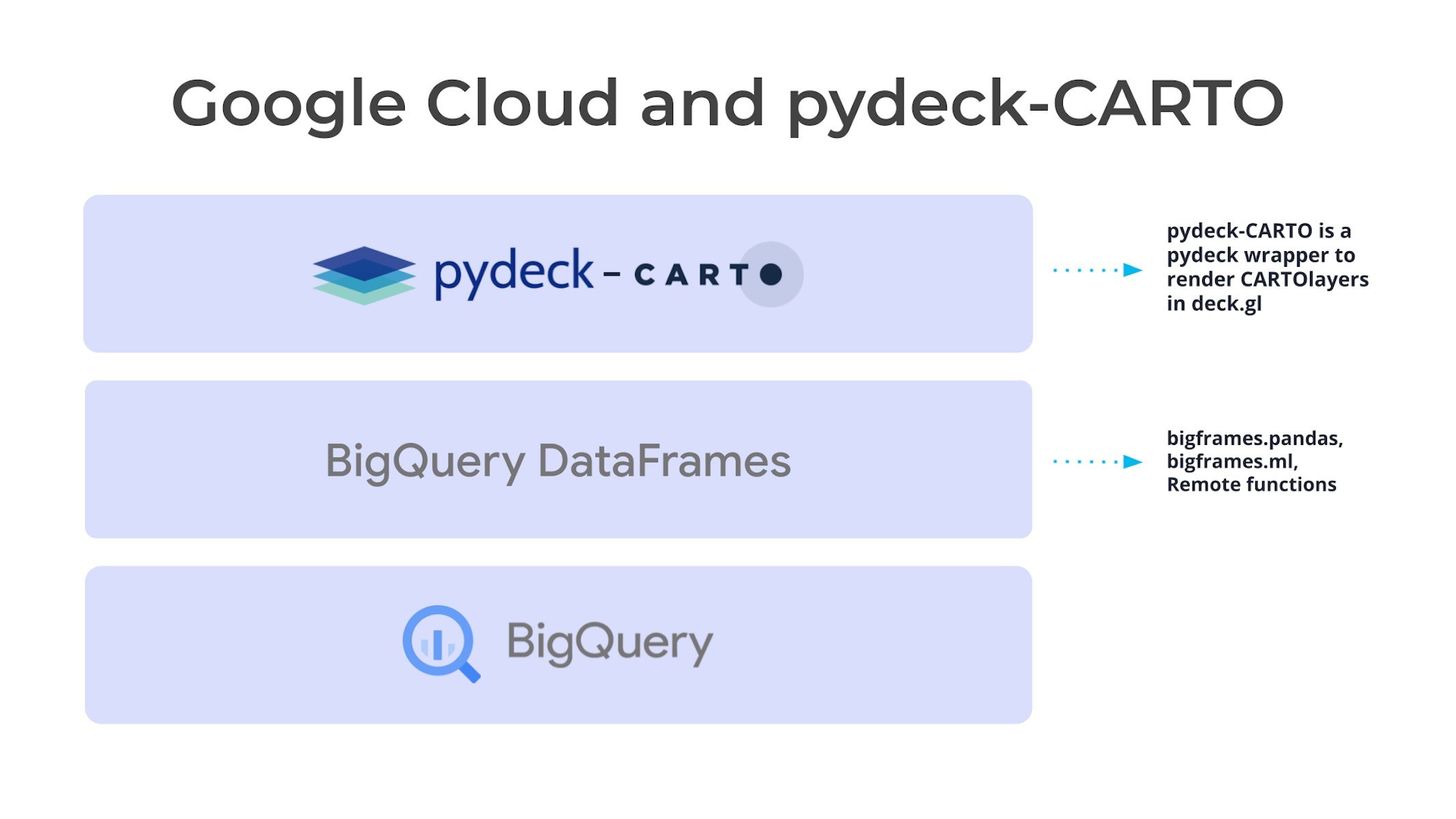
Streamlining geospatial analysis with BigQuery DataFrames and CARTO
To demonstrate the power of BigQuery DataFrames and CARTO, let's take a look at a practical example. In this scenario, we will build a composite indicator to represent the risk in the US from climate extremes, pollution, and poor healthcare accessibility, and use the Gemini 1.0 Pro model to provide a human-readable description of different risk categories. These different risk tiers can be used to inform various decision-making processes by a healthcare insurance company, such as:
-
Premium pricing: Areas with lower scores might be associated with reduced premiums, reflecting the potential for lower healthcare utilization due to less prevalent environmental risk factors and better access to care.
-
Targeted outreach programs: Healthcare providers could prioritize outreach efforts and resources in areas with higher risk scores, promoting preventive health measures and early disease detection.
-
Risk mitigation strategies: Insurance companies might collaborate with local healthcare facilities in high-risk areas to improve access to care or invest in initiatives like telehealth to bridge geographical barriers.
To follow along and replicate our analysis, you can sign up for a no-cost 14-day CARTO trial and run this Colab notebook template from the CARTO team.
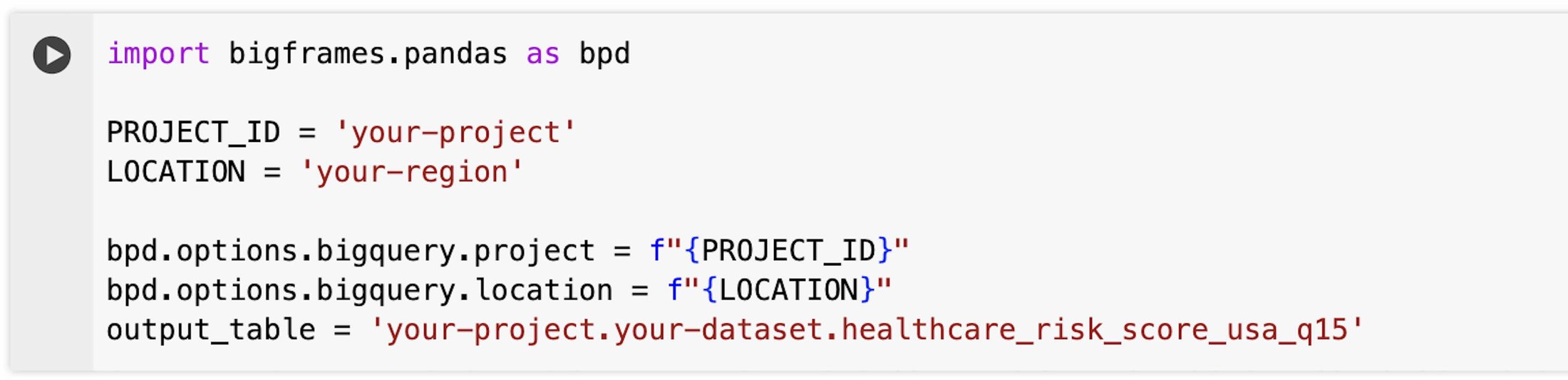
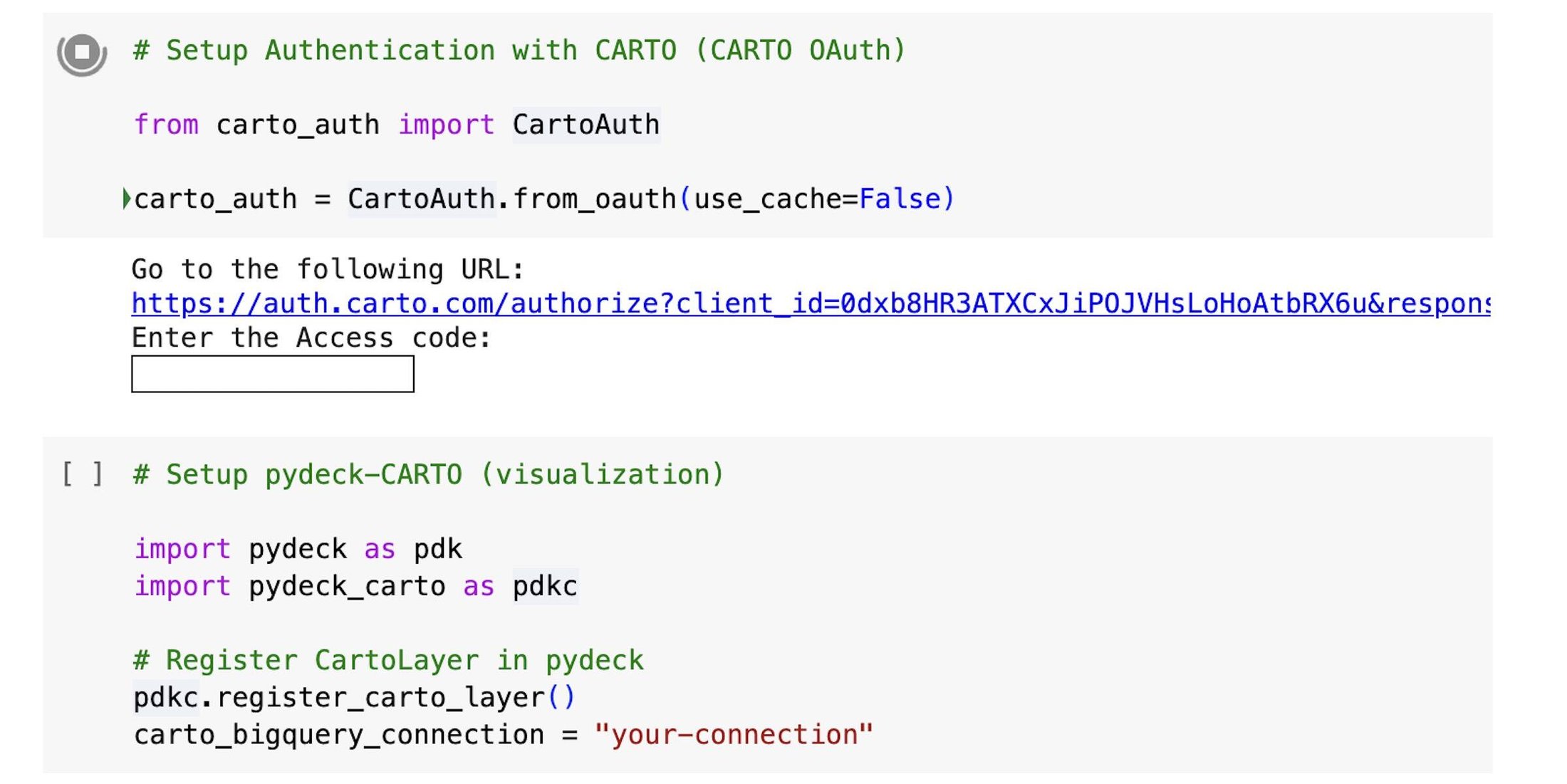
Step 1 - Set up
We start by importing the BigQuery DataFrames library:
Next, we set up the connection to CARTO using carto-auth, a Python library to login to your CARTO account, and then we register the CartoLayer in pydeck. This allows us to visualize data from any data warehouse connection established in the CARTO platform (e.g., to BigQuery) and to access data objects in the CARTO Data Warehouse associated with our CARTO account:
Step 2 - Input data
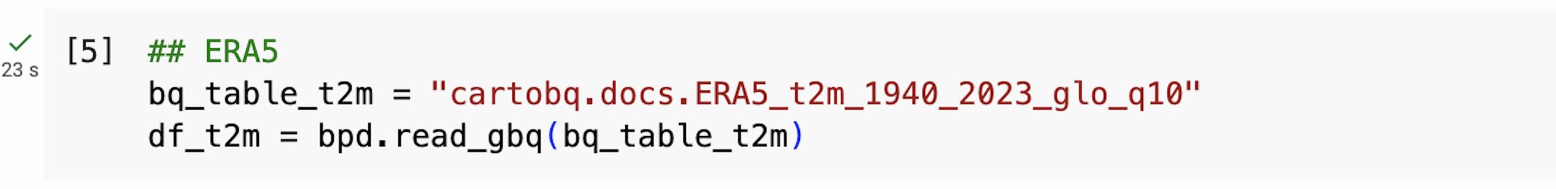
Next, we import data into BigQuery DataFrames.
For this example, we will be using the following datasets, which are available in BigQuery as public datasets managed by CARTO. All the datasets have been transformed to a hierarchical grid based on Quadbin indices, which provide a direct relationship between grid cells at different resolutions, for high-performance spatial operations:
-
ERA5 temperature data
(cartobq.docs.ERA5_t2m_1940_2023_glo_q10): monthly surface temperature data from the ERA5 climate reanalysis from 1940 to 2023 converted to quadbin resolution 10. -
Walking accessibility to healthcare services data
(cartobq.docs.walking_only_travel_time_to_healthcare_usa_q15): walking time (minutes) from the closest healthcare center from this study converted to quadbin resolution 15. -
PM2.5 concentration data
(cartobq.docs.pm25_2012_2016_usa_q15): yearly averages of PM2.5 concentrations from 2012 to 2015 from CIESIN converted to quadbin resolution 15. -
Spatial features
(carto-data.<your-carto-data-warehouse>.sub_carto_derived_spatialfeatures_usa_quadgrid15_v1_yearly_v2): demographic data from CARTO Spatial Features, a global dataset curated by CARTO which is publicly available at quadbin resolution 15. To access this data, follow the instructions to subscribe to a public dataset from your CARTO Workspace.
We can read this data with the read_gbq function, which defines a BigQuery DataFrame using the data from a table or query. For example, we can access the 24GB ERA5 temperature data table with the following code:
And then select only the data between 2018 and 2022 using the dt class, and compute the maximum and minimum values per quadbin:


Similarly, we can access the rest of the sources, merge the datasets using the quadbin key, and finally preview five arbitrary rows:
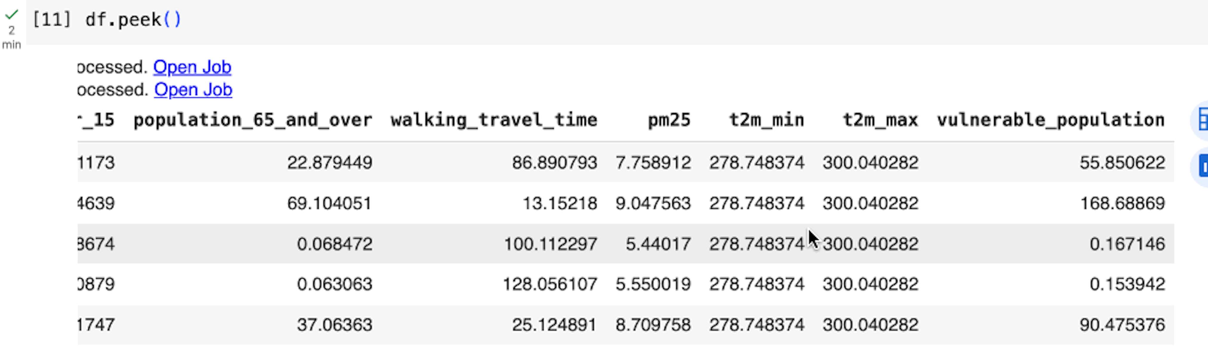
BigQuery DataFrames employs a lazy execution approach, where it progressively constructs queries on the client side until the data is requested or read (e.g., when we execute df.peek()). This allows BigQuery to optimize across larger queries instead of executing a query for each python statement.
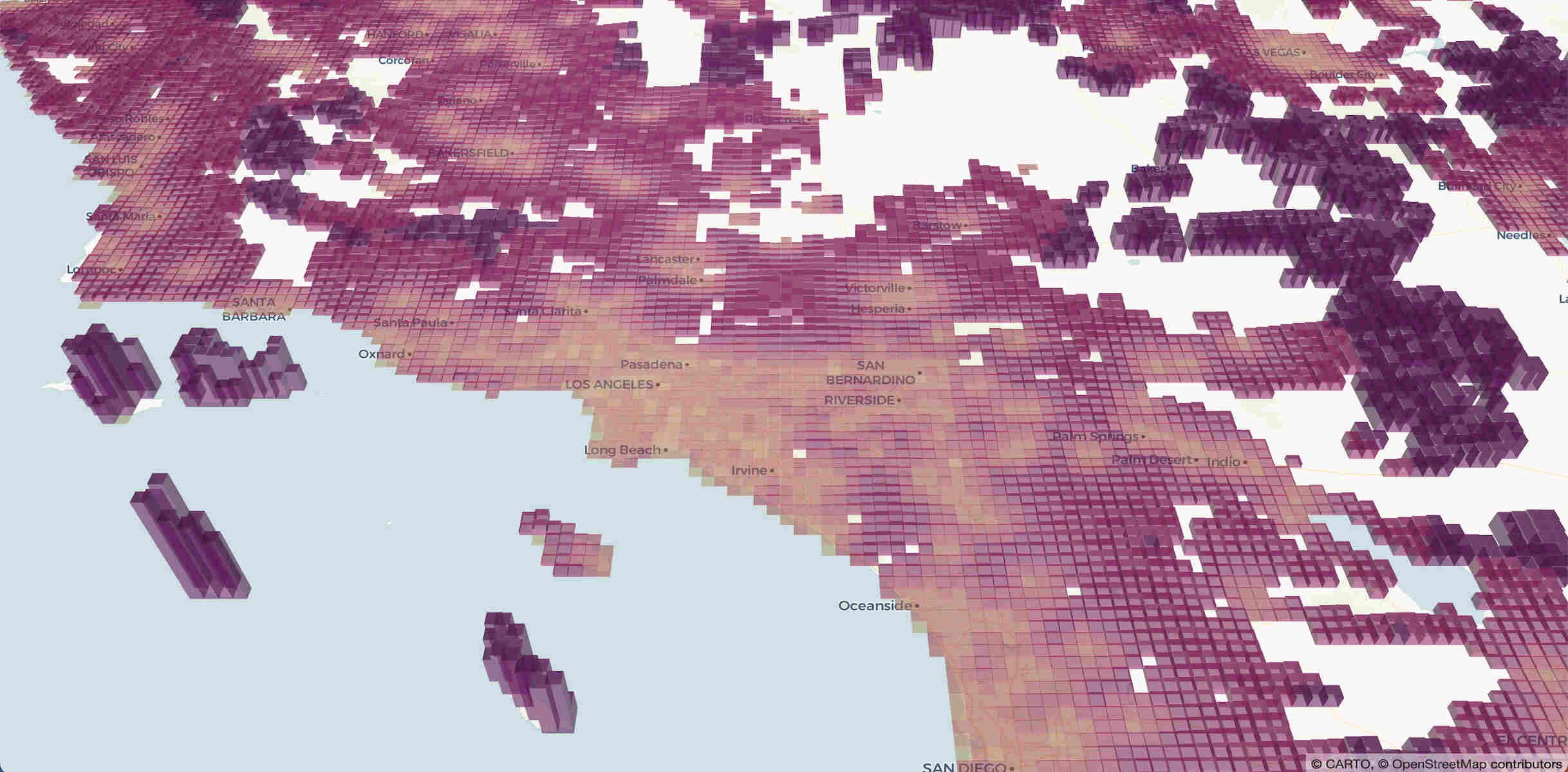
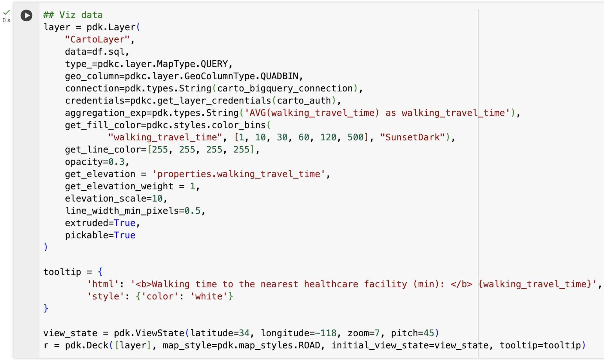
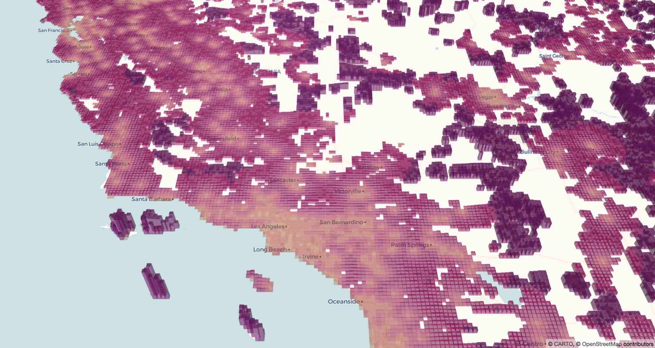
We can then for example visualize the walking time to the nearest healthcare facility, generating an SQL query with BigQuery DataFrames sql method as the input to pydeck-CARTO, and using a 3D visualization with a color bins styling to better highlight areas with different categories of healthcare accessibility.
Step 3 - Create the composite indicator
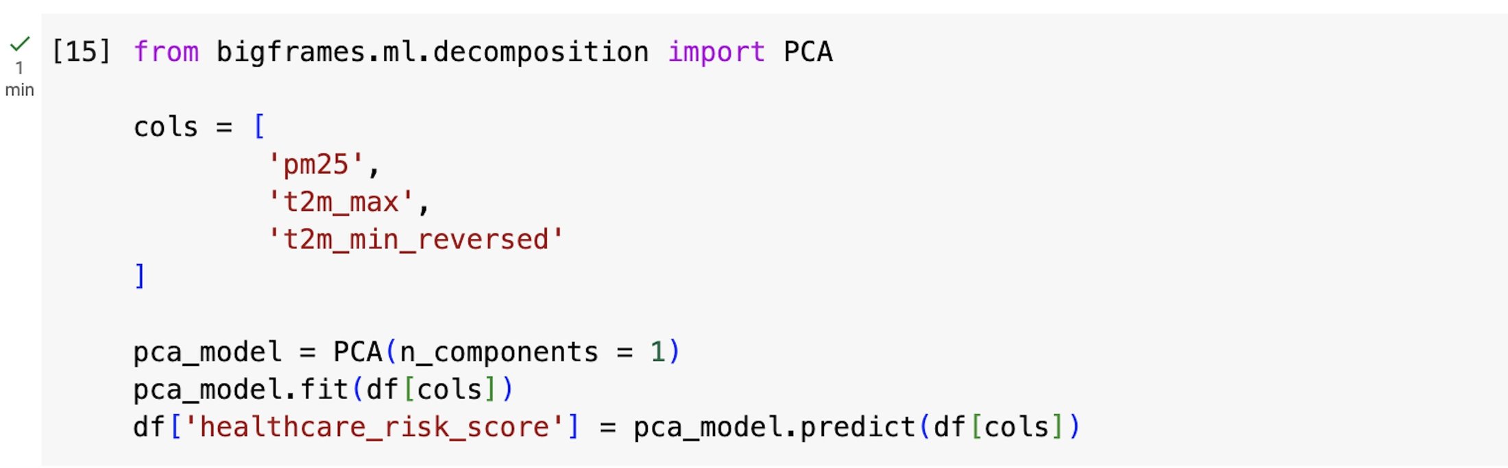
In the next step, we want to define a composite indicator that represents the combined health risk of an area due to the selected external factors: maximum and minimum temperature, the concentration of the PM2.5 pollutant, the total and the vulnerable population (children and senior citizens), and the walking time to the nearest healthcare facility.
Before computing the indicator, we need to ensure that for all input variables, higher values correspond to higher values of the indicator. This is already true for most variables, but for the minimum temperature, we will instead consider the reversed values (i.e. the values are multiplied by -1).

The indicator is then derived by computing the principal component score from a Principal Component Analysis (PCA) using the selected environmental variables. This can be done using the following PCA class:
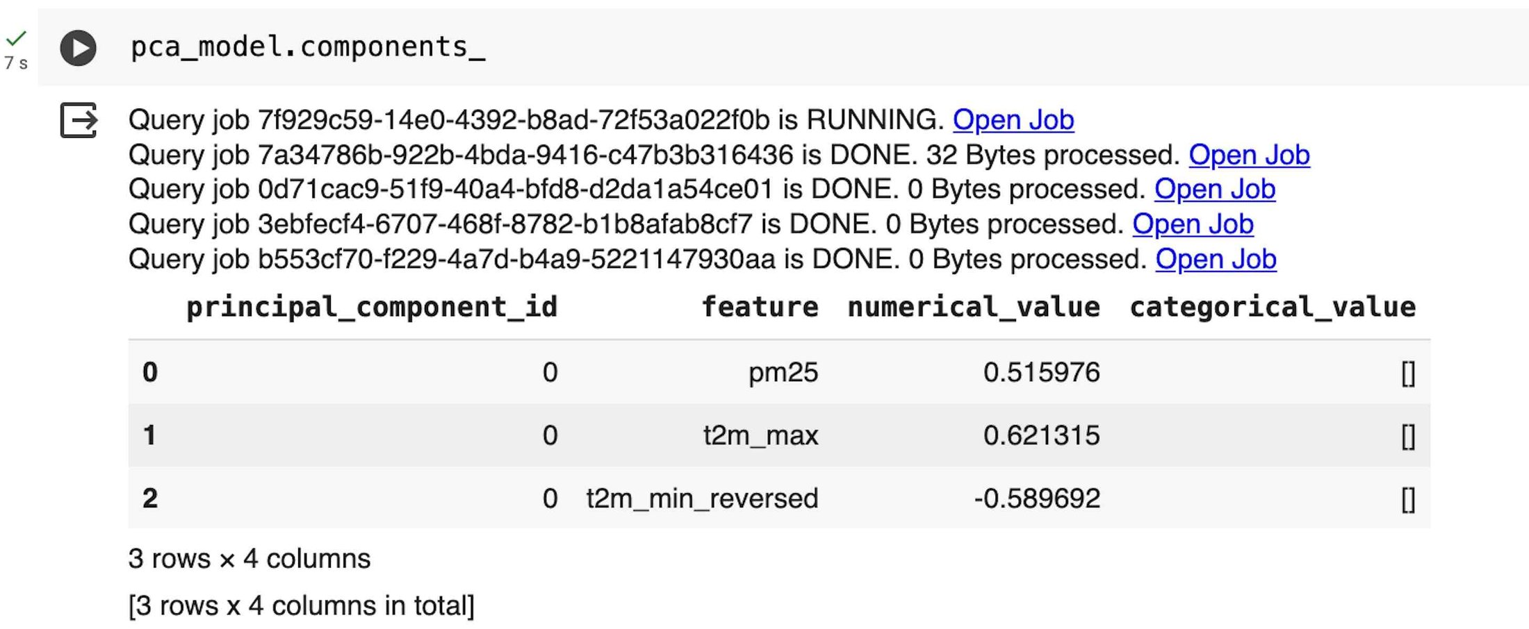
By printing the principal components (PC), we can also check that their sign (which is arbitrary) is correlated in the intended way with the first PC score. In this case we would require a positive correlation with the PCs for the maximum annual temperature and the PM2.5 concentration, and a negative correlation for the minimum annual temperature with the sign reversed. On the contrary, we would need to revert the sign of the derived first PC score.
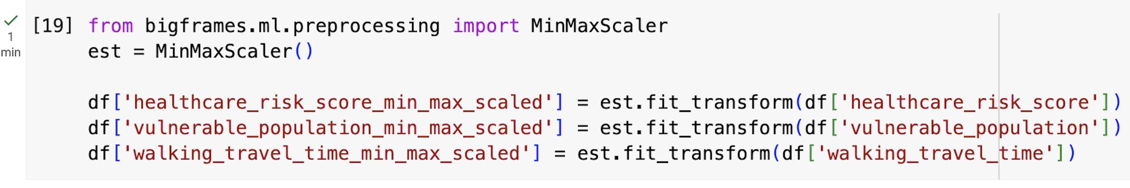
The first derived PC, which represents the maximum variance direction in the data, is then linearly combined with the vulnerable population and the walking time to the nearest healthcare facility, all scaled between 0 and 1 using the MinMaxScaler class to make their dimensions comparable.
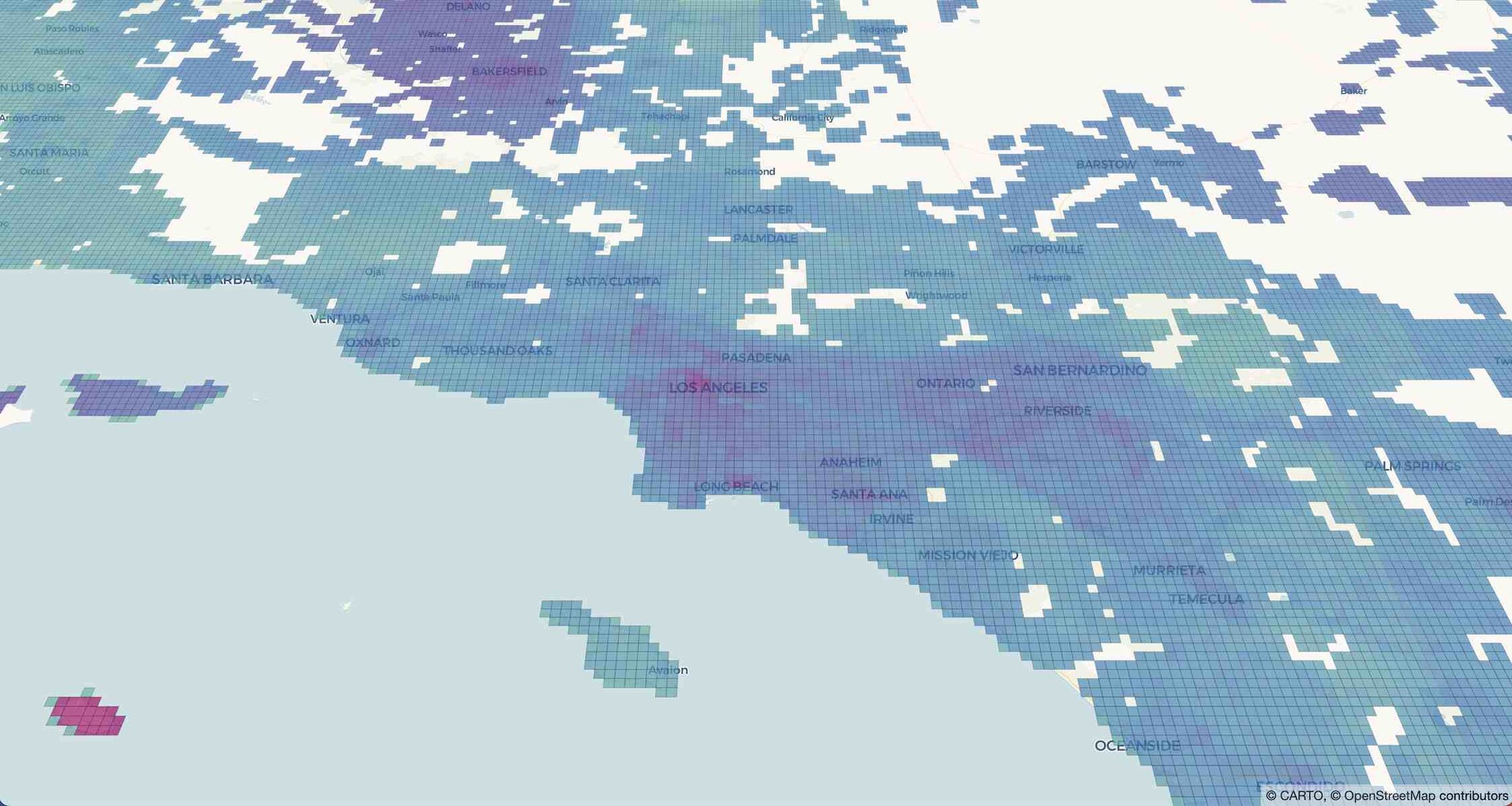
Finally, we can visualize the results on a map using pydeck-CARTO with a continuous color layer to smooth the derived indicator.
Step 4 - Use gen AI to describe the indicator
In this final step, we use BigQuery DataFrames to create a dataset with prompts that describe different classes of values of the risk score. We also use the Gemini 1.0 Pro model to describe each class based on the value of the indicator and of the variables used to derive it.
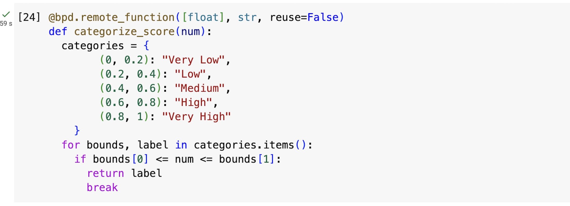
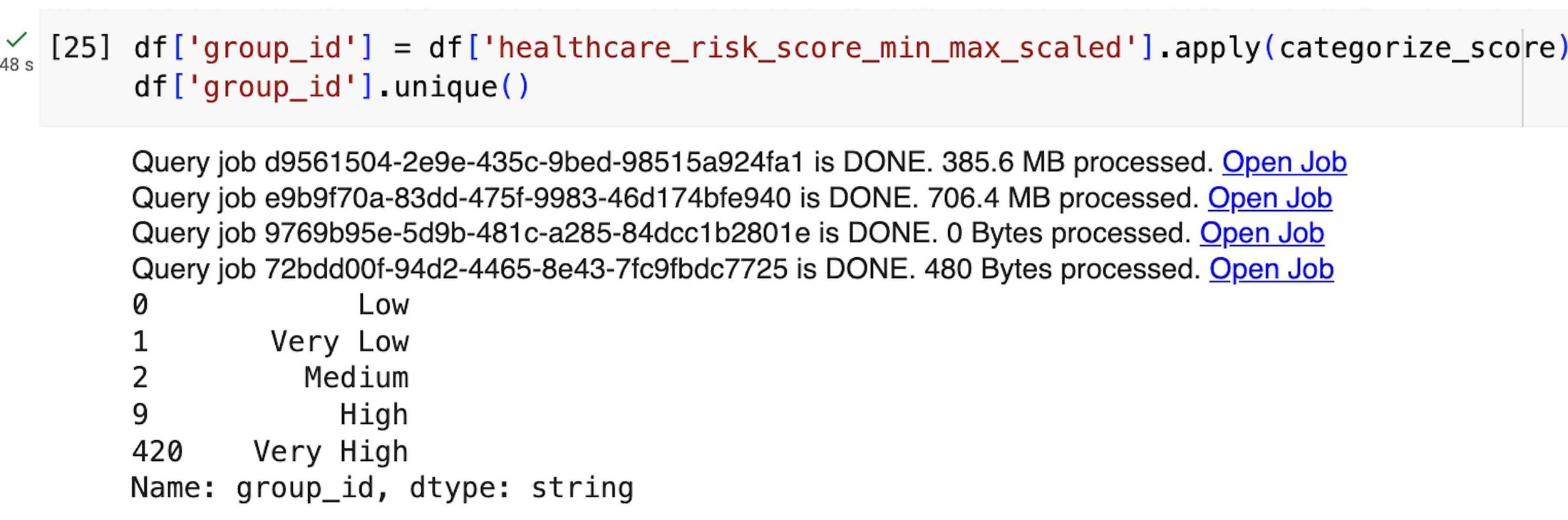
First, we create a remote function to categorize the score in five different risk categories: Very Low, Low, Medium, High, and Very High. Remote functions give you the ability to turn a custom scalar function into a BigQuery remote function, which can be applied to a BigQuery DataFrames dataset.
Next, for each category, we compute the mean of all the variables used to derive the indicator and compare with the mean from all the score categories. We can then derive the relationship between the group and population mean through their relative differences.
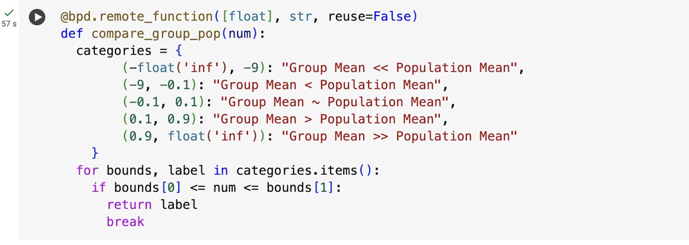

According to the adopted logic, when the group mean is within the ±10% of the population mean, the group and population mean are considered similar. When the absolute value of the group mean is up to 10 times the population mean, the group mean is considered larger (smaller) than the population mean, and much larger (much smaller) otherwise.
We then make a single-row DataFrame with our prompt, preceded by a plain-English request that defines the context of the task, and we import the GeminiTextGenerator model
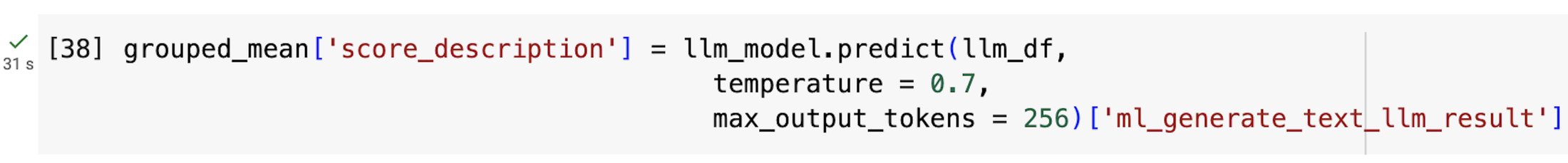
and finally send the request for Gemini to generate a response to our prompt:
Next we can visualize the results on a map with human-readable descriptions of the results of this analysis:
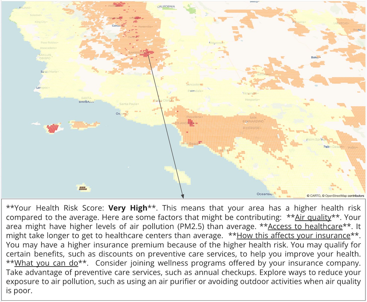
Map with one of the human-readable descriptions highlighted as an example.
Location, location, location
In this blog post, we’ve seen how BigQuery DataFrames can serve as a unifying tool for diverse users including data analysts, data engineers, and data scientists, providing them with a familiar and potent interface for handling large-scale datasets. By smoothly integrating with pydeck-CARTO, which enables the creation of interactive maps directly within the notebook environment, the BigQuery DataFrames API not only helps simplify tasks such as data exploration, cleaning, aggregation, and preparation for machine learning but also enhances their power, enabling users to extract valuable insights from geospatial data effortlessly.
Get started with location intelligence in the cloud with your no-cost CARTO and Google Cloud trials, and explore the example from this blog post. To learn more about BigQuery DataFrames, check out the sample notebooks and documentation.